Home Page: written down

Home - week four

After having a very sluggish unproductive time last week, on all fronts, I have given myself a good stern talking toand I am trying to catch up on ALL my commitments.

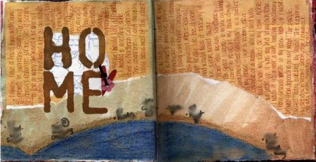
So I am sharing my week four page … Home

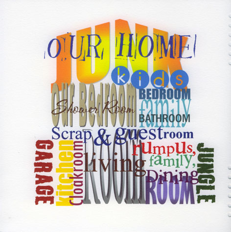
I tried to keep it simple and almost in the sahpe of our house, viewed from the side, all the rooms in just about the right places too… not sure if it is too SIMPLE, but hey that’s me !!!

Might add some personal stuff later, a strip of map and the house number maybe ?!?

Well thanks for looking

Louise

Weeks 2 & 3

I know it’s late but just like Colleen said, I tend to “Over think” about a topic. I’ve started pages and then go back and redo until finaly I just have to let go and all that I have thought of goes foggy.

Here’s my risk page:

Here’s my wheels page:

Both topics I “over thought” about and then I gave it a rest and just tried different things like inking the edges of pictures and tearing stuff out of magazines.

In the first grade, my history teacher told us that when taking a test, 9 times out of ten, the first thing that we think of when answering a question, it’s the right answer.

I think that applies to art too.

Week 4: Home

I’ve been having a hard time conceptualizing home for this challenge, and today after seeing pages posted by Dona Bumgarner and Kristin Harris, I realized that I was really expecting too much of the word “home.” Home for me isn’t a place or a house, it is more of a feeling. So, I stopped over-thinking the issue and just went with what I felt. And, Kristin’s piece challenged me to use black in my pages as a background as well and I like the end result.

I used images of the four places that I’ve lived that have had the most impact on me and my life: Salisbury (NC), Miami, Kingston, and Atlanta (where I live now). The paints are acrylics in black, purple, blue, and a lime green, and of course my zig writer pen.

Thanks for the inspiration ladies, and thanks to everyone else for looking!

weekend spark page (week 4)

Here’s my page for the recent weekend spark. It’s a simple one, but I think it gets straight to the point. LOL!

Risk page

Way behind but determined. The title is ‘living is a risky business but giving up is not an option’. I used the bleached photo idea. I won’t tell you the nasty comments that I got from my dear children. LOL. Stamping and sharpie on the photo. Grey paint dry brushed over watercolour paper, black around the photo. The red pen is legible but not bright enough.

Journalling.
Although the outside world is a scary place to a farm kid, we took loads of risks at home. We used to dive headfirst out of haylofts, sit in the rafters of barns and climb trees.
I know exactly when I became afraid of everything. I married the wrong guy. Terror was a way of life until I became terrified for the safety of my kids. Then I stood up to him and left.
But I was still afraid. Afraid that I was the bad mother that he said I was and afraid that he would take my kids.
Then I met Dave. He spent 21 years building me up. Life was good. Any fears we had we shared. After Dave died I expected to be afraid but I’m not although I don’t take risks.

Midweek spark - three books

I chose Footprints by Margaret Fishback Powers. My favourite spiritual work.

Millionaire Moments by Chris Tarrant because I love quiz shows and I would like to be a millionaire.

The Smile of a Dolphin by Discovery channel. I love dolphins . The photo is of me kissing Thelma the dolphin at Discovery Cove.

home

This is my response to the “home” prompt. I don’t connect with images of houses as a lot of artists seem to, and I’ve always wondered why. After thinking about it while I worked on this page, I’ve decided it is because I have always moved often, both as a child and as an adult, and also because we don’t yet own a house of our own. The idea of a home is fairly fluid for me, separate from the house itself. I long to have a home/house that is ours, but we just can’t afford it yet – the CA real estate market is crazy. What feels like home to me is both big – the part of this state where I have settled – and small – the nests I make in my living and working environments where I retreat to recharge. The image here is a bird’s eye view of the coastline where I live. I blurred the text in this image, but along the coast I’ve written in the 7 addresses to each of the homes I have lived in in the 12 years I’ve lived in this community. One house I lived in twice, so that’s really 8 houses in 12 years. Hopefully the current one is the last for a while…

Background is Daniel Smith Iridescent acrylic paint on watercolor paper, drawn into with Lyra art crayons and colored pencil. Title is stenciled with a letter template from the hardware store onto a map fragment. Journaling written on Creative Imaginations PP.

Cover Art

Finally finished my art journal cover. The background is a piece of paper I had in my stash, and I just brushed some blue and green watercolors on it. The film strip and butterflies are vellum that I also found in my stash. The letters are rub-ons from Making Memories. Pretty scrappy cover, but I’m pleased with it.

Week 3: Wheels

Still catching up. Here’s my page for the wheels challenge. I was really inspired by the colors in some gladiolas I bought at the grocery this weekend. They are yellow with orange centers, and the colors really spoke to me.

The green is watercolor, but the rest of the paint is acrylic. The C is a Basic Gray monogram, and the ink is my Zig pen. The journaling says: “The Wheels of inspiration are FINALLY turning” and the journaling in the center is from a Blood, Sweat and Tears song called “Spinning Wheel”:

“what goes up must come down
spinning wheel got to go round
Talkin ‘bout your troubles it’s a crying sin
Ride a painted pony let the spinning wheel spin”

Thanks for looking!

first posting but not first entry

I’ve been off working at my own pace over in the corner here, jumping around from topic to topic. I’ve finished several pages in my book so far, but most are probably not interesting to anyone but me. :) I really love how this page came out, though.

This one landed somewhere between the “risk” and “favorite place to be” suggestions. There is a certain amount of risk involved in just being who I am in the world, and I’ve been trying to figure out how to express how I feel about that visually. I haven’t quite figured it out yet, but this is a start. I’ve also been working on accepting myself for all of the things that I am – trying to reconcile the apparent contradictions. Learning to just be who I am, no apologies.

I’m coming to this class as a painter/collage artist, though I’ve been recently intrigued by scrapbooking and figuring out ways to use my photographs in my work. This class has been a good way to play and stretch my style.

Acrylic background on watercolor paper painted with Golden acrylic paints. Text printed on transparency backed with vellum (Remington font), Basic Grey tag.